ARCADE visual identity
A new space for creative people.
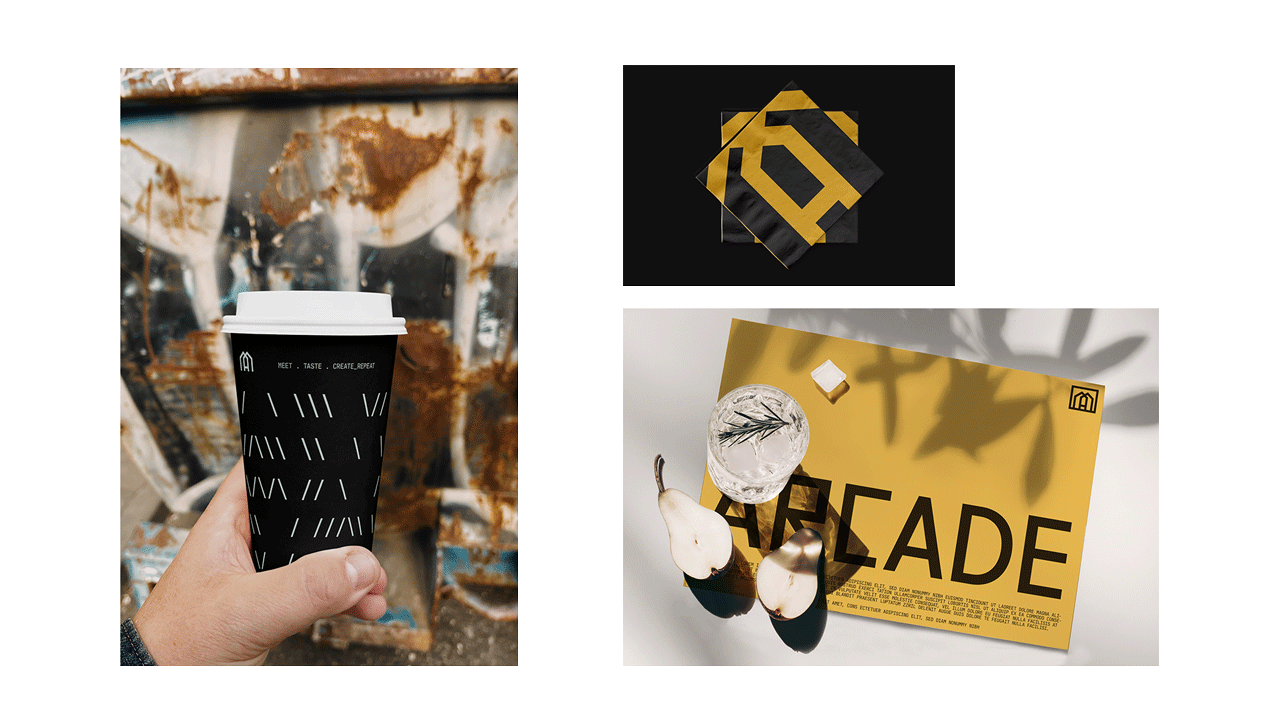
The branding and optical identity for “Arcade” embraces the concept of contiguous arches, to create a sheltered and inviting space. It draws inspiration from the historical significance of arcades, which are a succession of arches. These arches symbolize the structural support and strength of the multivenue.
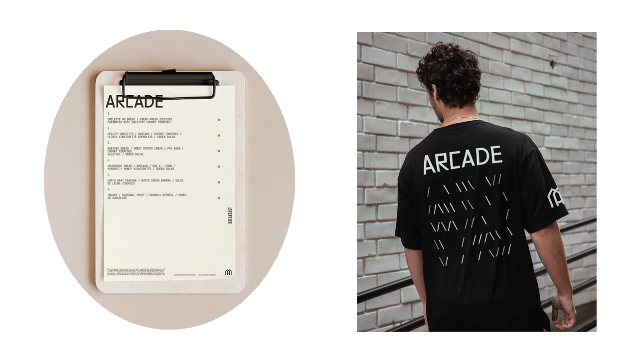
The logo itself takes on an angular form, reflecting the architectural elements of an arcade. It adopts angular shapes rather than semicircular forms, aligning with the desired aesthetic. The angularity adds a modern and dynamic touch, conveying a sense of energy and excitement. The optical identity also incorporates various angular elements, such as intersecting lines, diagonals, or sharp edges, to create a visually engaging and distinctive style for the Arcade Complex.
Typography complements the angular logo design by utilizing bold and geometric typefaces. These typefaces further enhance the contemporary and dynamic appeal of the brand identity.
By combining the concept of contiguous arches, angular forms, and strong typography, the optical identity for Arcade reflects the intersection of activities and the variety of experiences offered. It represents a modern and inviting space that embraces both tradition and innovation, creating a visually captivating identity.