Chiroprattein visual identity
The human body as an optical space.
Its textures and shadows as those are shaped over bones and muscles.
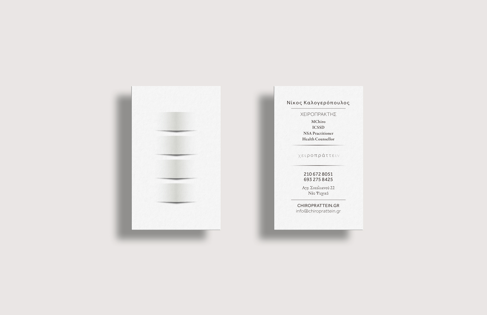
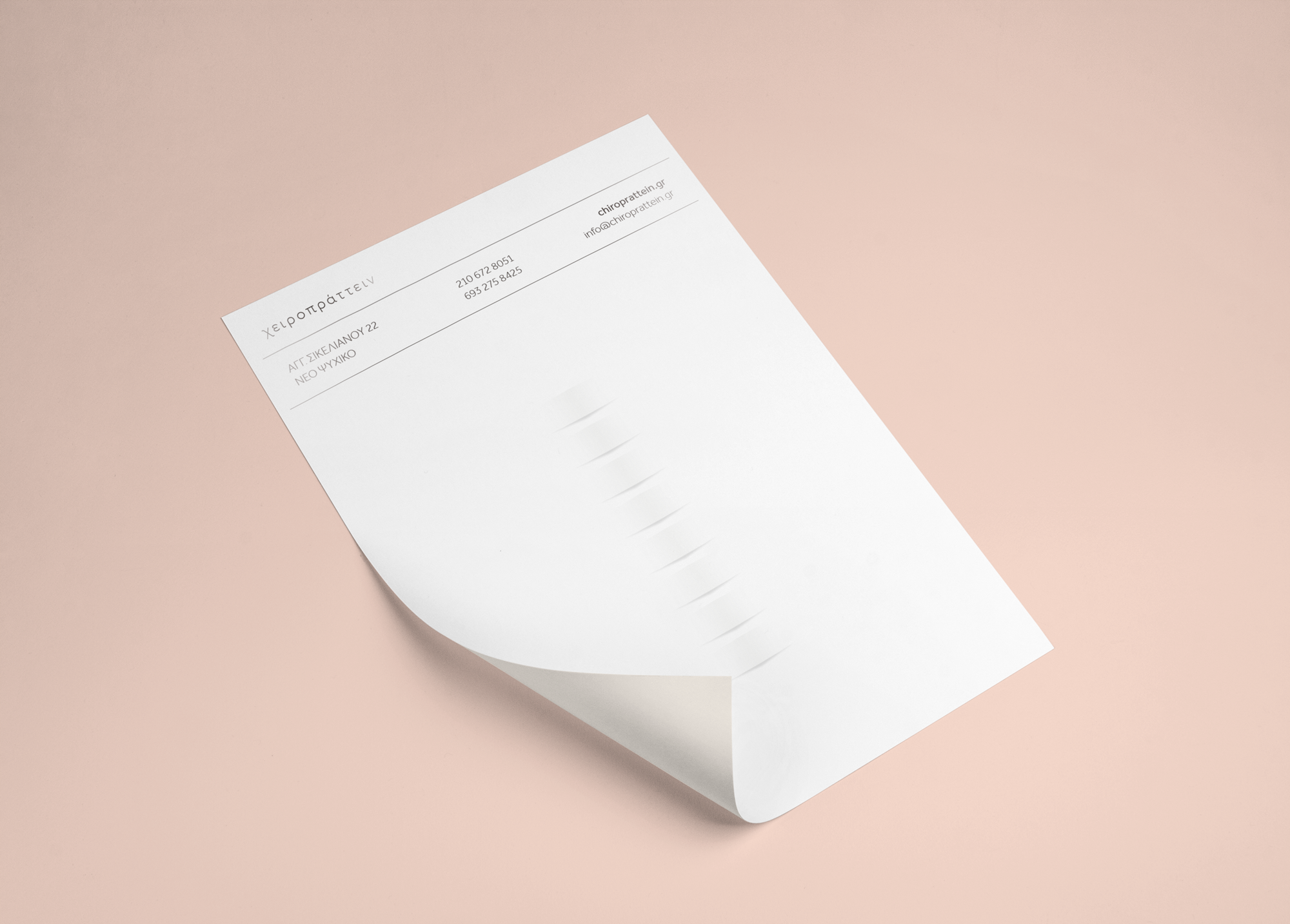
Aiming at high simplicity and purity we created one simple curve as our symbol, a game
of light that highlights the forms. A sense of ease and gentle relief prevails, as parts of the spine are rendered with the simplest geometry.This visual language also works cumulatively, with one “vertebra” being able to be placed in a column with others, resembling the whole of a human spine.
The typography uses thin and loosely connected characters that give away an ethereal feeling, while it discreetly compliments the visual part of the logo. The colors’ range is deliberately limited, to a very soft off-white that best praises the embossed-like qualities of the design.