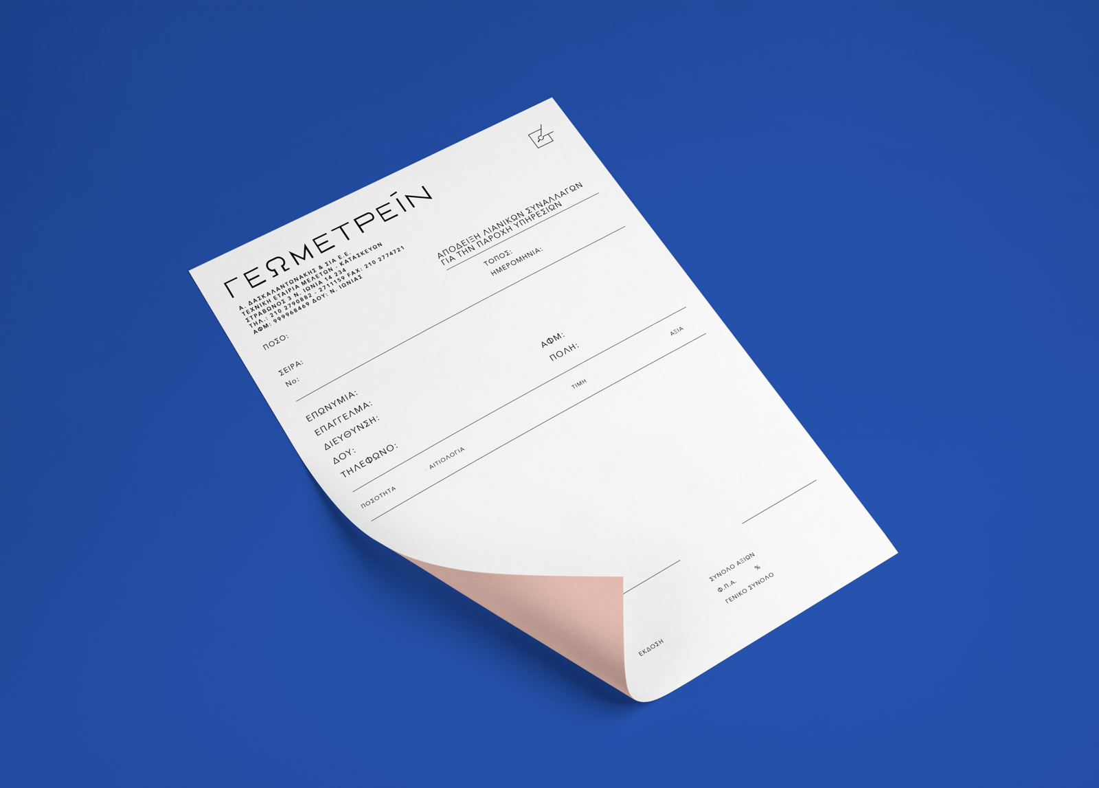
Geometrein visual identity
An unpretentious approach, focusing on information and the brand name itself.
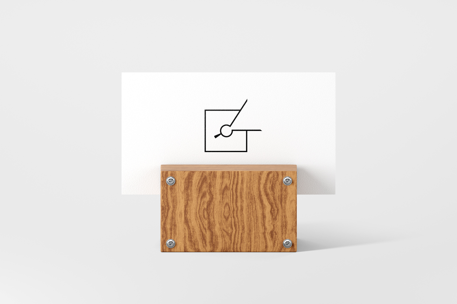
The robust symbol stems from the combination of two elements: a calliper and the form of the letter “G”.
Additionally, the custom font allows us to fully match it with the visual identity.
Strength is shown through wide elements, which act as foundations.
Thick lines emit confidence. Absolute geometric rigor that is rooted in tradition but also looks modern today.