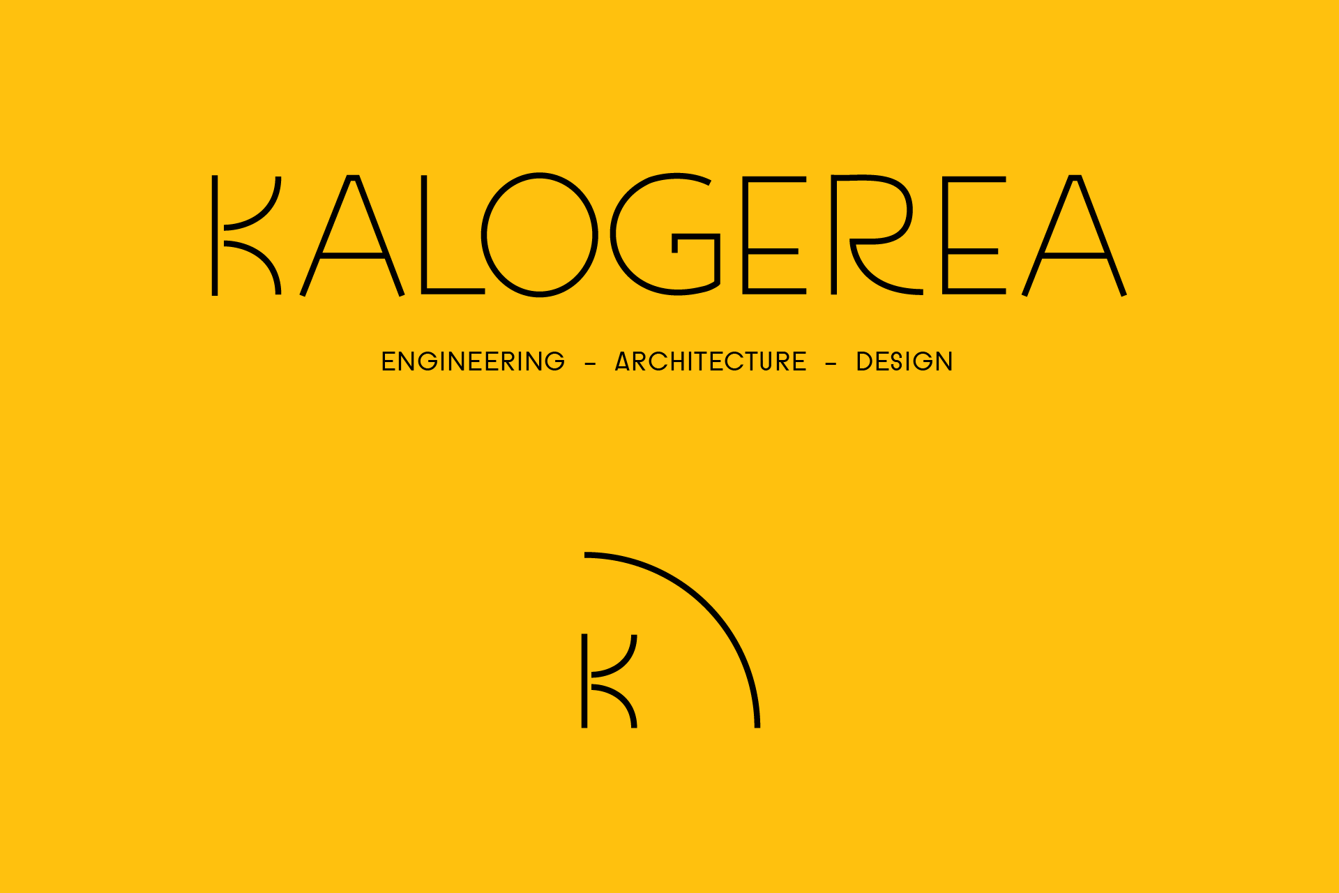
KALOGEREA visual identity
Visual identity for Kalogerea Studio, a creative team specialized in architecture, engineering & interior design.
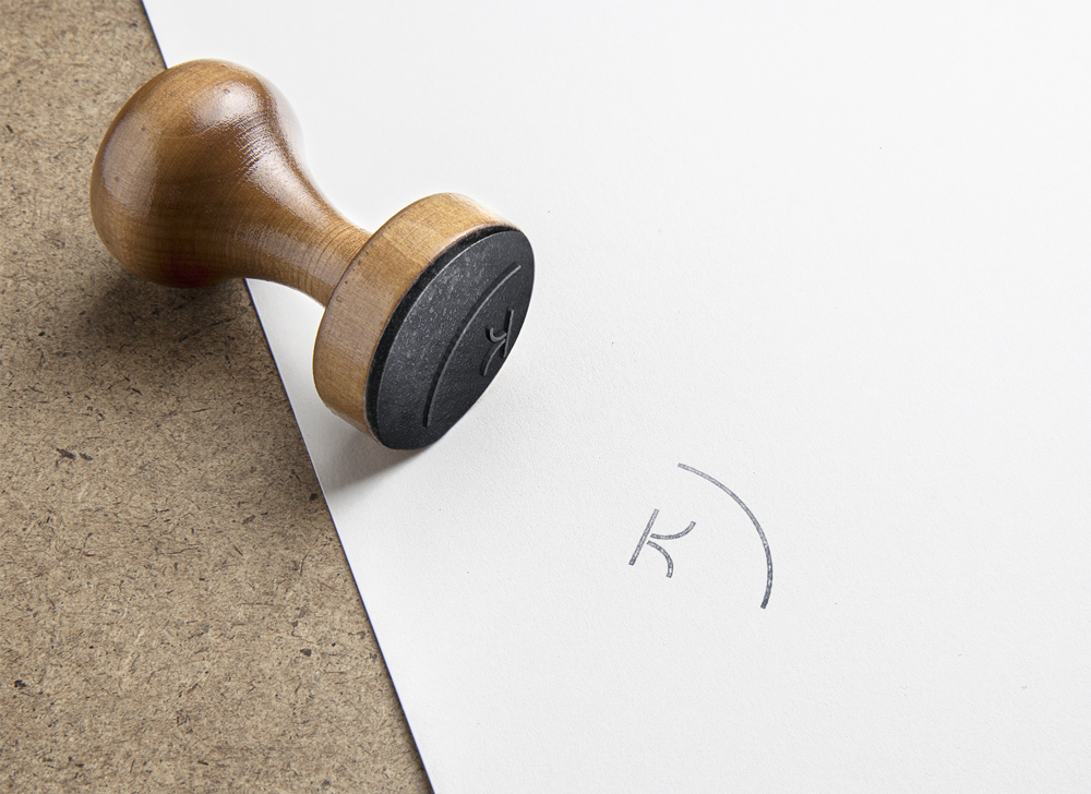
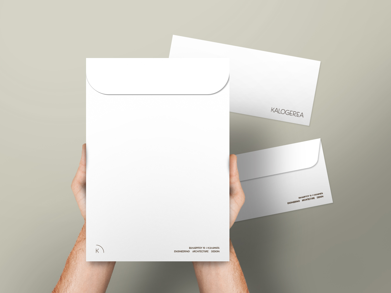
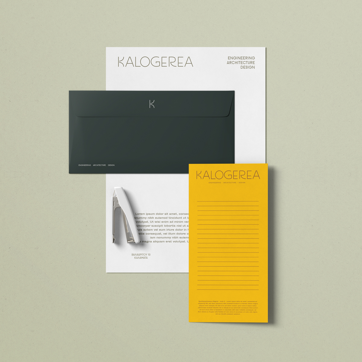
A minimal and clean approach was followed. A customised font was created for the letters of the logo staying true to the elegance and geometry the client was looking for. Forms from Bauhaus movement and modernism were part of the inspiration along with symbols used in architecture floor plans.Printed applications.
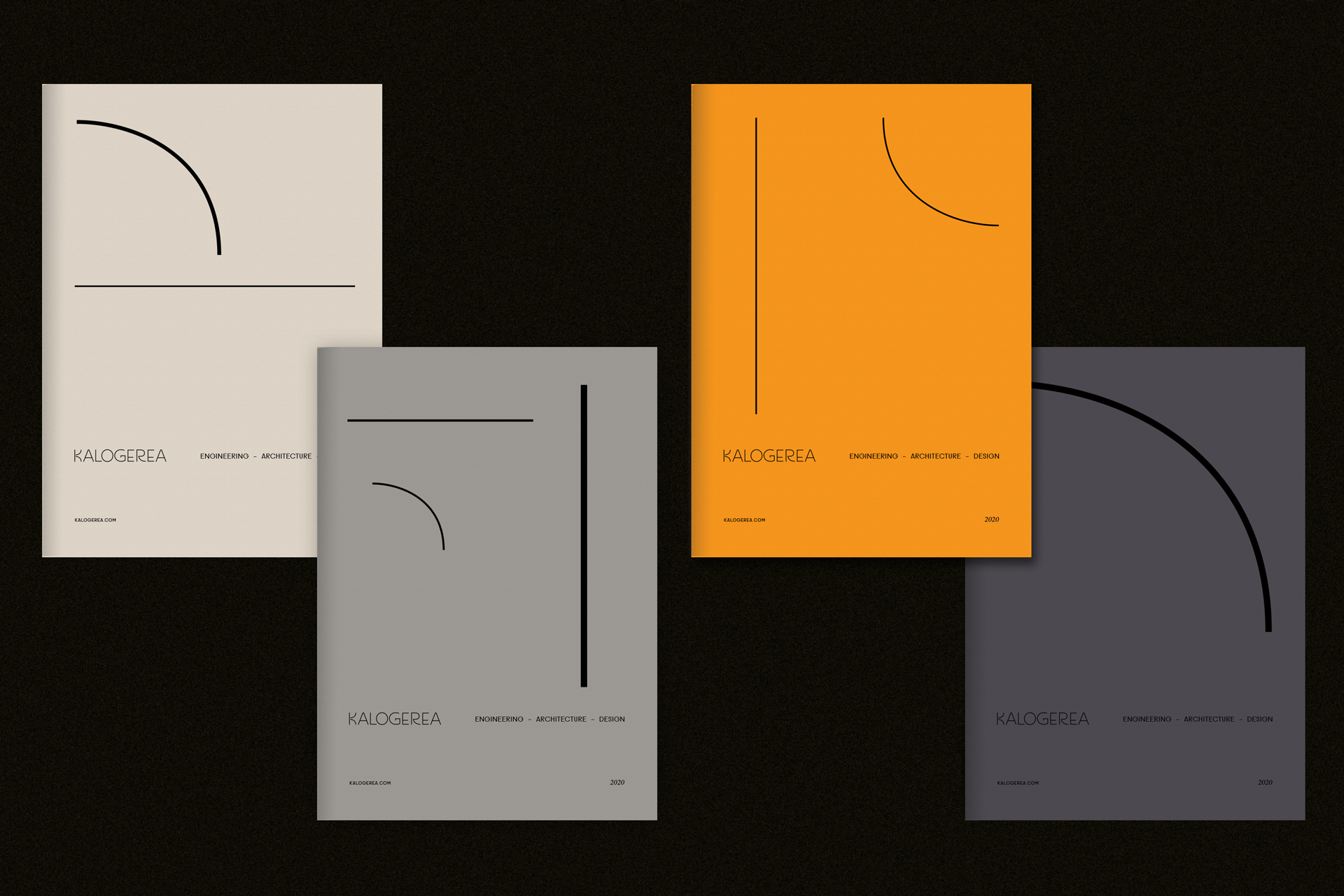
Notebooks
Following the corporate identity we created for the custom logo font, we deconstructed its curves and elements, in order to produce separate visuals for each notebook cover color. Four different types of paper were used for the covers according to the earthy color palette.
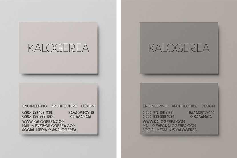
Business Cards
Four different papers in tones of gray (cement, stone, sand) give an immediate impression of various building materials. Their texture and shades frame the typography of the card consisting of uppercase legible characters, thin on the front side and more solid on the back.