NIM Architects visual identity
Rebranding of NIM architects, a small company of three interior architects.
In order to strengthen the brand’s image and increase its relevance,
we decided to create a refreshing and striking visual identity that would
emphasise the bond between the team members.
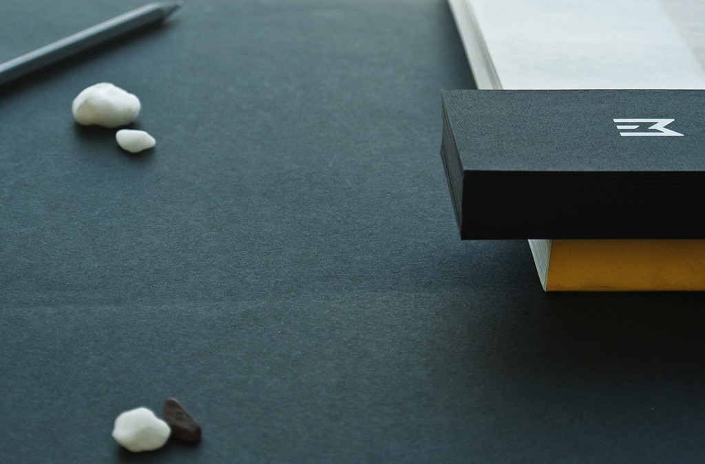
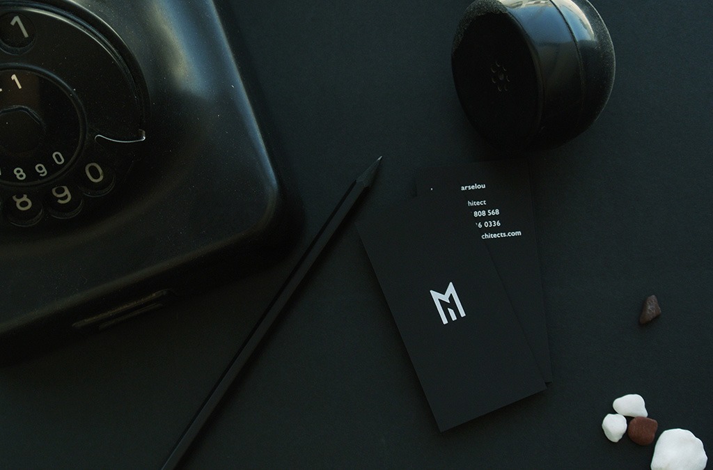
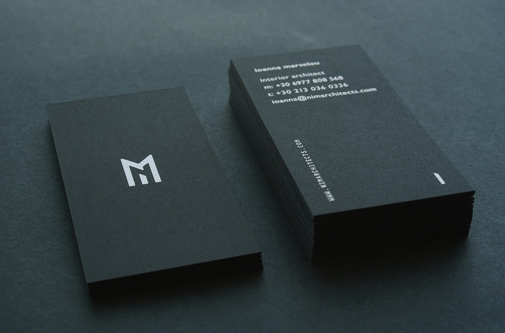
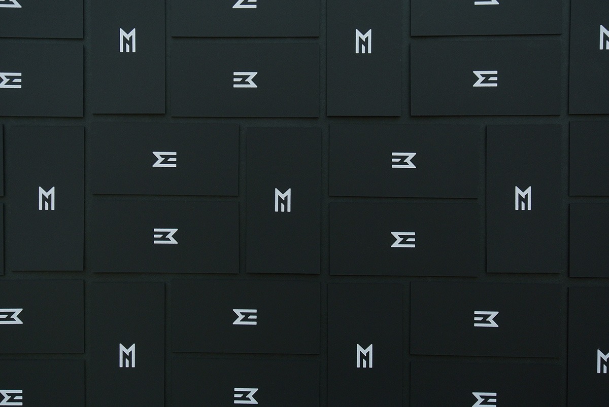
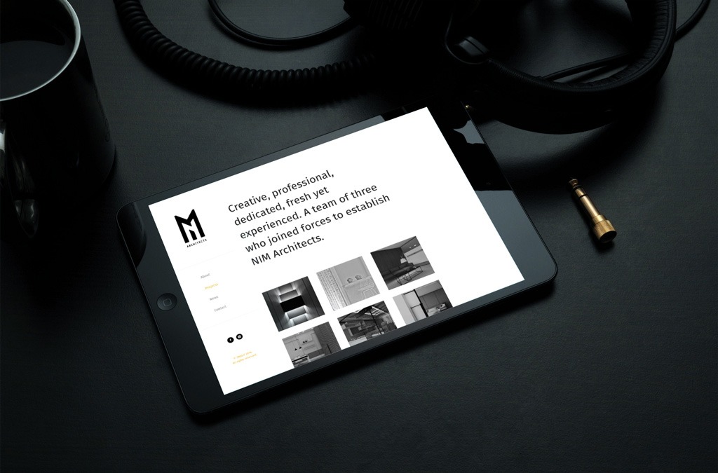
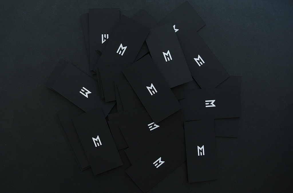
The redesigned logo consists of 3 letters, one for each founding member of the NIM team.
It works both as a cluster forming the NIM acronym,
and as three separate logos, personalising the three members’ business cards.
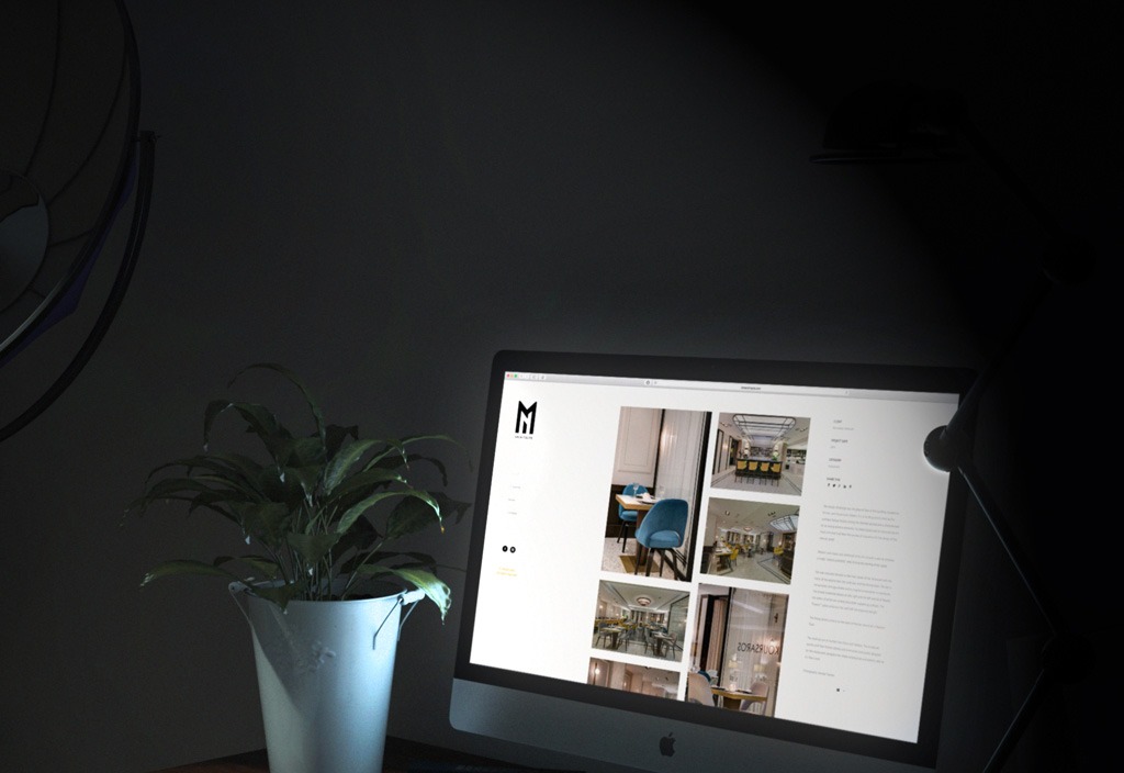
Black and white where chosen as the brand’s main colours
with a splash of yellow for the website.
A clean sans serif font (Gill Sans) is heavily used,
complimented by a monospace secondary font.